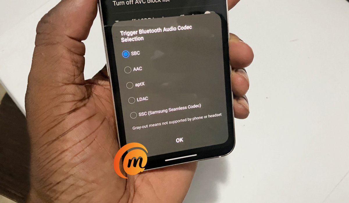
Published since 2014, MobilityArena is the essential guide for mobile phone users in Western mobile phone markets like the U.S., the U.K., the E.U., and Australia. We provide information about Bluetooth codecs, Infrared/IR blaster, IP rating, wireless charging, and other specs of cell phones released in these markets.
Latest Updates
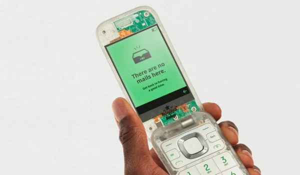
- The Boring Phone Lives Up To Its NameThe Boring Phone is so well designed that it offers you zero excitement and distraction.
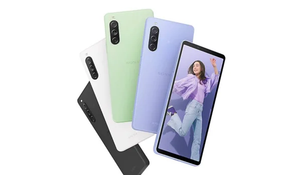
- The Top Small Smartphones of 2024The top small smartphones of 2024 consists of phone models from Apple, Samsung, Google, Sony, and Asus.
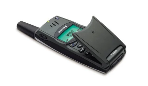
- 4 Of The Best Old Flip Phones: Life Before SmartphonesOld flip phones were mostly boring, but I owned some fascinating models that stood head-and-shoulder above the rest.
- How to Summarize PDF with AI – 3 Ways for a Smarter PDF WorkflowAre you looking for the best AI tool to quickly summarize PDFs? Discover the most powerful AI assistant to summarize, explain, translate, and write documents.
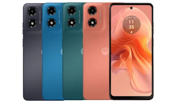
- Motorola Moto G04s: Bluetooth Codecs, Infrared/IR Blaster, IP Rating, Other SpecsMotorola Moto G04s has been announced for the European Union, with a sub-€150 price tag. Availability includes Latin America, the Middle East, Africa, and Asia.
- Best Compact Smartphones under $500 dollars in 2024Our pick of the best compact smartphones under $500 that you can buy in 2024. We also list the cheapest.
- PDAF in Mobile Phone Cameras ExplainedPDAF is a feature that helps camera phones focus faster, especially when capturing images in motion. Here is how it works.
- Introducing Seamless Software Update in AndroidThe new Samsung Galaxy A55 5G comes to the table with seamless software updates aka A/B updates. Mister Mobility explains what it is and the benefits.
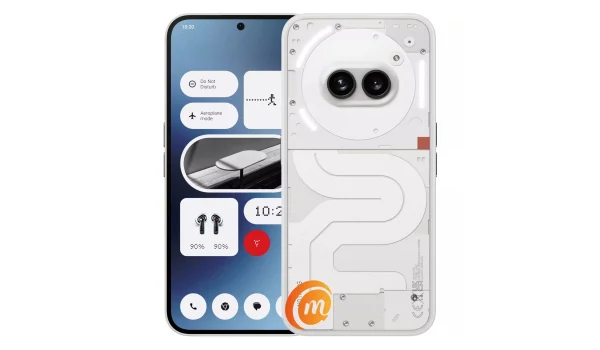
- Nothing Phone 2a: Bluetooth Codecs, Infrared/IR Blaster, IP Rating, Full SpecsDoes the Nothing Phone 2a have eSIM, aptX Bluetooth codecs, wireless charging, waterproof IP Rating, IR blaster, headphone jack, and other features you want?
Featured Reviews

